The American Board of Anesthesiology
This project is a redesign of the previous doctor portal and MOCA® program for The American Board of Anesthesiology® (ABA). The ABA is the certifying body for anesthesiologists since 1938. They administer primary and subspecialty certification exams as well as the Maintenance of Certification in Anesthesiology™ (MOCA® program, which is designed to promote lifelong learning, a commitment to quality clinical outcomes and patient safety.
My Role
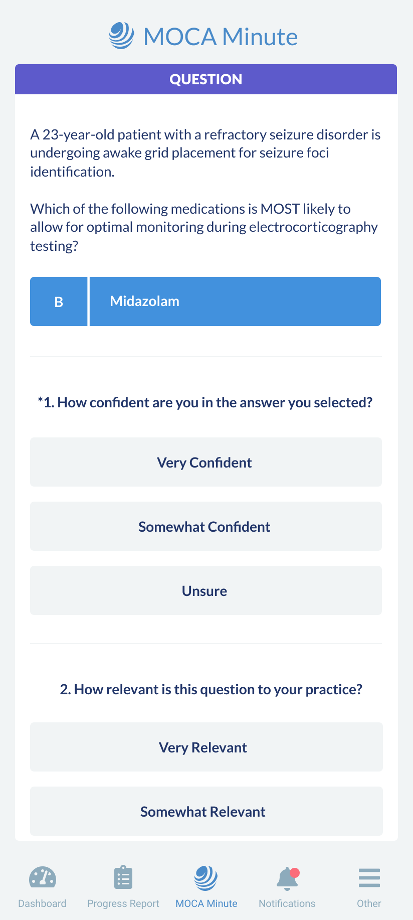
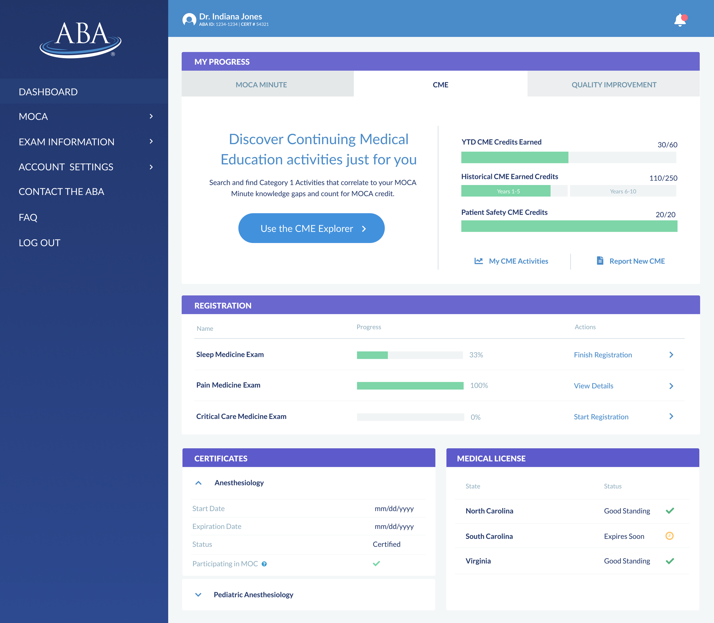
As the sole ui/visual designer for the ABA’s doctor portal, my primary responsibility was to develop a cohesive and modern design that could seamlessly support both the responsive desktop and mobile web versions, along with a standalone mobile app for iOS and Android.
-
There were a couple of big requirements for this project. The first was that it had to adhere to a highly specific user flow which was based on medical and legal specifications. The second was that both platforms needed to function from the same React Native codebase, ensuring consistency and efficiency.
-
Understanding the Existing System:
The first step was to analyze the previous portal to understand its functionality and identify pain points. This was followed by a comprehensive design audit to evaluate which elements were essential and where improvements could be made.
Research and Ideation:
After researching best practices for portal dashboards, I focused on solutions that effectively incorporate progress charts, as this was an essential feature to show a doctor's certification progress throughout the year. Once I had a clearer idea of the direction we needed to take, I started to wireframe the main pages like the dashboard, Moca Minute questions, Continuing Medical Education, and QI Activities. This phase also involved exploring typography and color schemes to establish a new visual language.
Typography: Lato was selected for its clarity and versatility.
Color Palette: The final palette was chosen by our focus group of doctors from three different palettes that I developed to ensure alignment with their preferences.
Dashboard and Navigation Concepts:
With foundational elements in place, I developed multiple design concepts for the dashboard and navigation. These concepts were shared with project stakeholders and the user group for feedback and approval. Once the direction was finalized, I proceeded with designing the remaining pages.
Prototyping and Handoff:
Prototypes: Interactive prototypes for both desktop and mobile app versions were created to simulate user interactions and validate designs so that stakeholders and our focus group could provide their final input and approval.
Developer Handoff: Once everything was approved, meetings were held with developers to discuss details and answer questions. The figma files were then prepared and delivered with detailed redline instructions to ensure a smooth and fast implementation.
-
This process ensured the new portal’s design was modern, user-friendly, and aligned with the project’s technical requirements. The collaborative approach with stakeholders and user group helped create a visual system that not only met the functional needs but also resonated with doctors.
What I Learned
At first, the process seemed rigid due to user flows being strictly defined for legal and medical reasons. However, that wasn’t the case. Through strong communication with the ABA’s brilliant stakeholders and developers, meticulous planning, and continuous user testing for feedback, the project became both well-informed and highly enjoyable.
Figma Prototypes
Below are links to the Figma prototypes of the desktop and mobile layouts for you to explore.
Mobile Screens
Desktop Screens
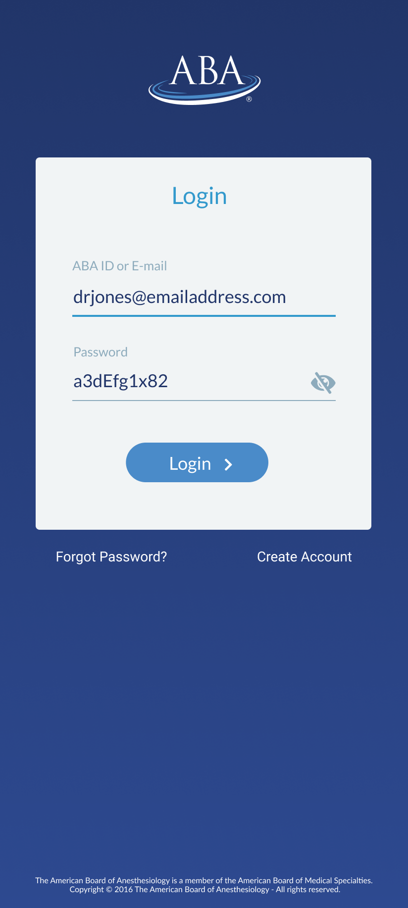
Login
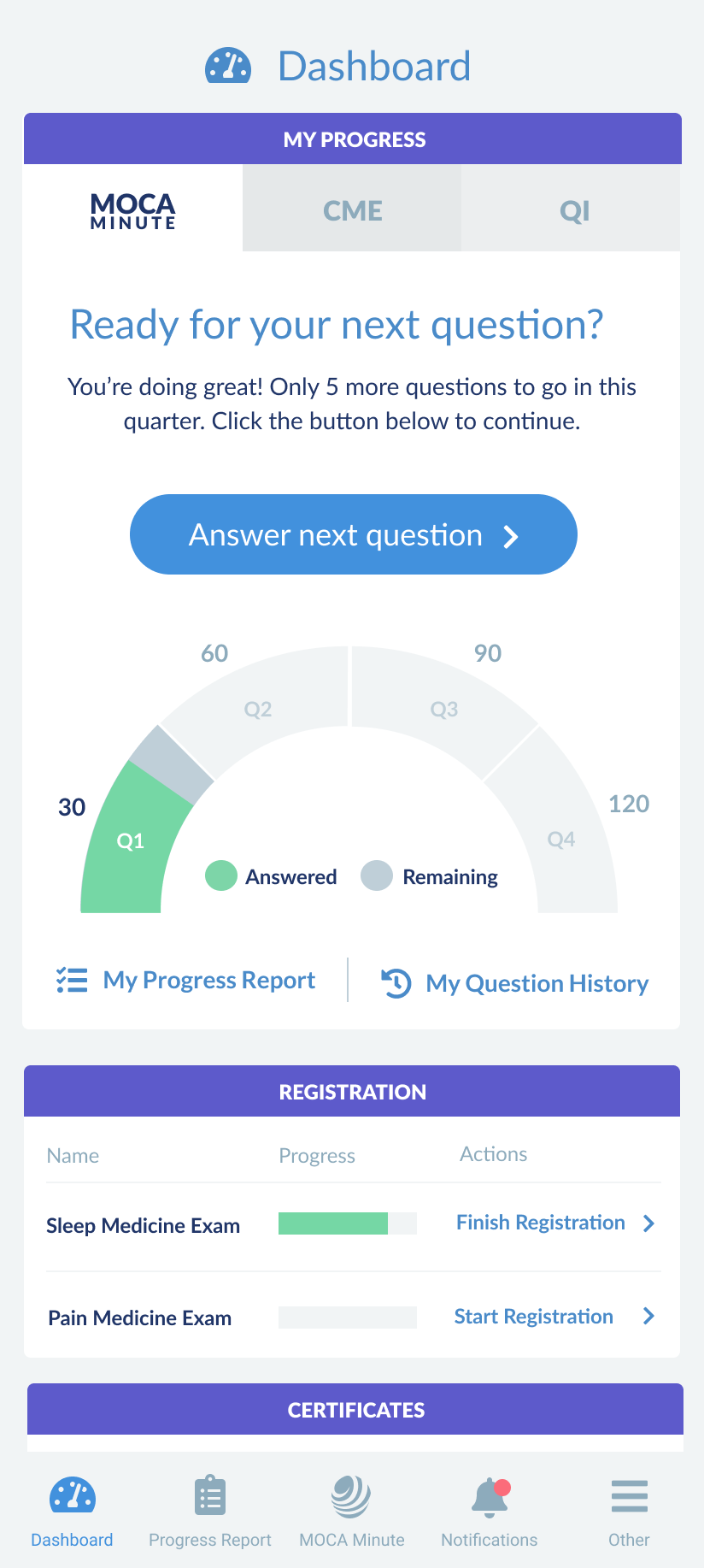
Moca Minute Tab
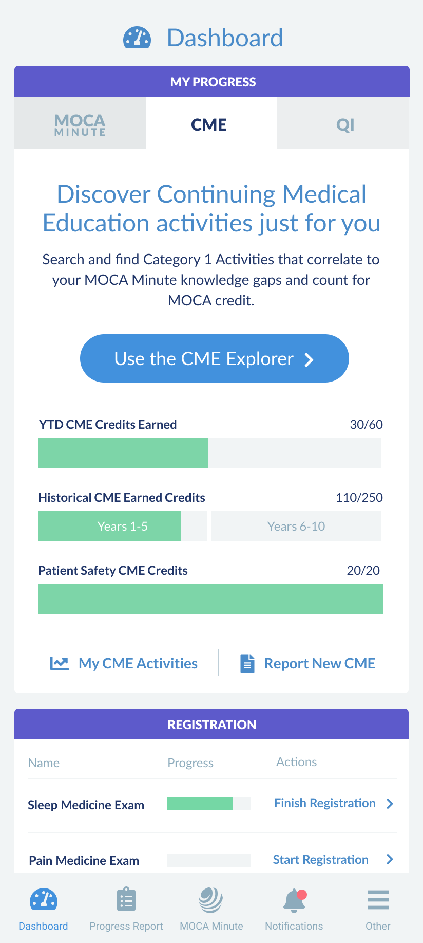
CME Tab
QI Tab
Ready to Start?
First Question
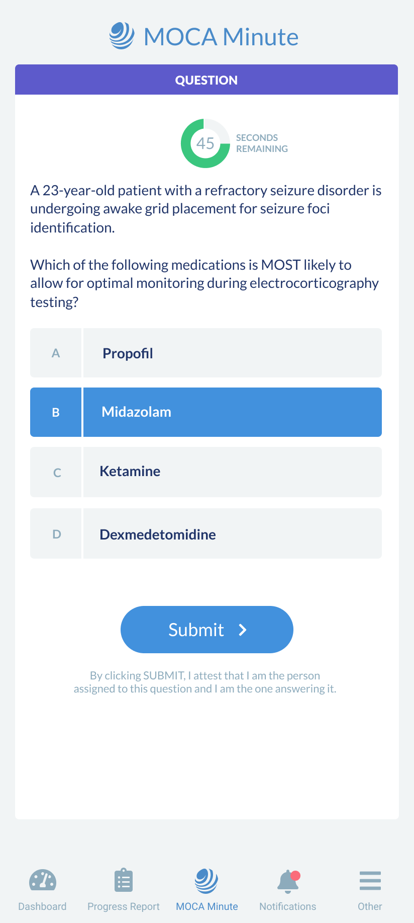
Answer
Correct Answer
Incorrect Answer
Progress Report Collapsed
Progress Report Open
Notification Center
Design Details
These are the key design elements finalized for the Doctor’s Portal redesign project.
Color Palettes
UI Library
Typography
Charts & Graphs


