Cardinal Financial
This project is the redesign of the main website for Cardinal Financial, a nationwide mortgage lender serving all 50 states and Washington, D.C., with a team of over 2,200 employees. At the heart of its operations is Octane, a proprietary loan origination system designed and built in-house. Cardinal Financial provides a diverse range of mortgage products and services, customized to meet the unique needs of its customers.
As a Key UI/UX Designer for the award-winning Cardinal Financial (CF) website redesign, I played a critical role in transforming the digital experience for CF customers. This project earned the 2022 W³ Gold Award, recognizing excellence in web design and functionality. My contributions spanned across UI/UX and visual design, ensuring an intuitive, visually appealing, and highly functional interface.
UI Design Contributions
Engineered desktop and mobile navigation, ensuring a seamless experience across different screen sizes and devices.
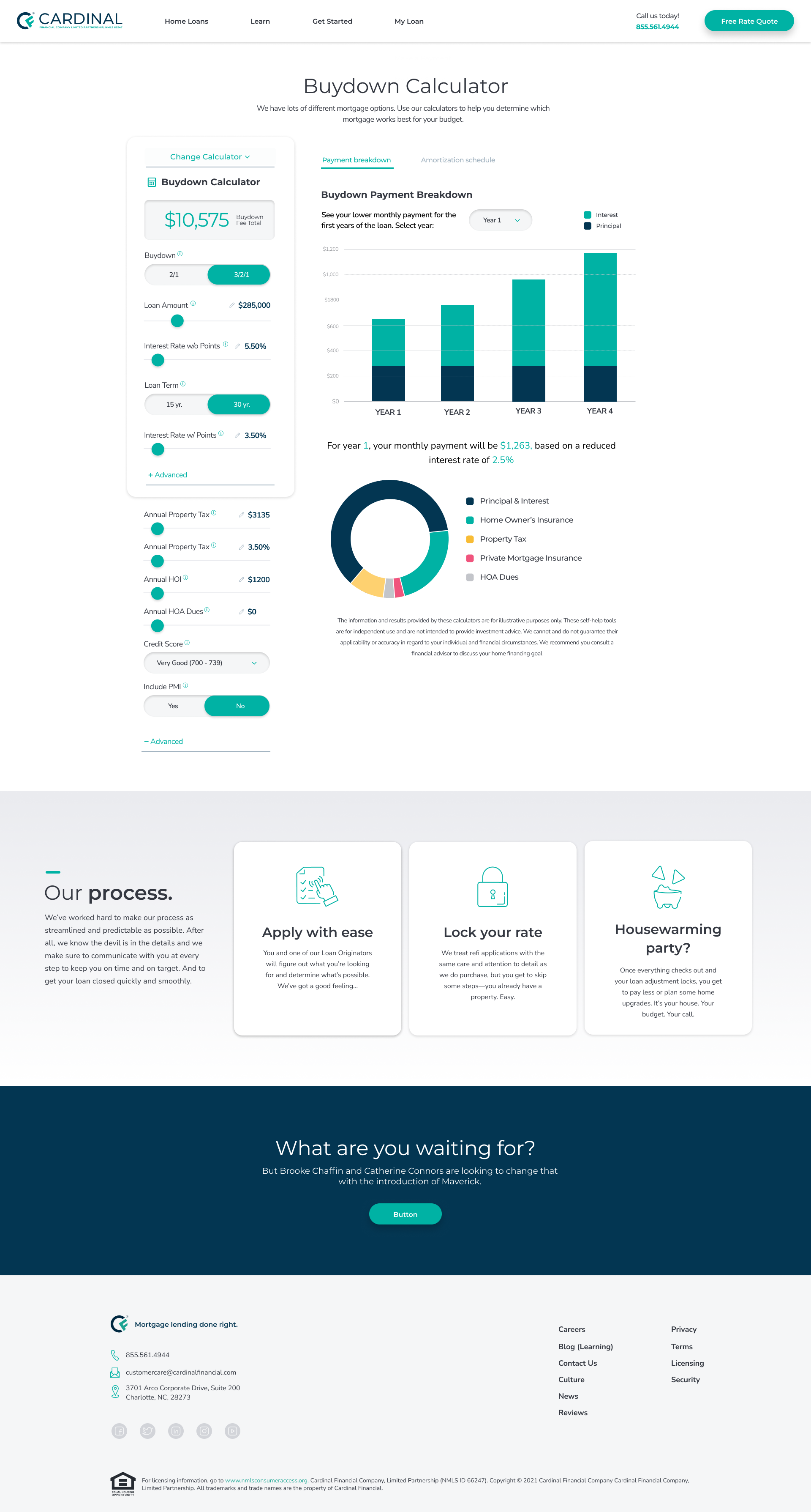
Designed a series of interactive mortgage calculators, allowing potential customers to easily compare loan options and make informed financial decisions.
Integrated an intuitive loan originator search tool, streamlining the process of finding and connecting with loan professionals.
Built an interactive job portal, enhancing CF’s career section with a visually engaging and user-friendly interface.
Ensured interface design elements aligned with Usability Heuristics standards.
Reviewed and prepared finalized designs for development hand-off.
UX Design Contributions
Developed comprehensive wireframes and interactive prototypes to visualize user flows and key interactions before development.
Conducted usability testing to ensure readability and color contrast met usability standards.
Visual Design Contributions
Translated creative concepts into usable design patterns and components for seamless implementation.
Designed multiple introductory landing pages for various sections of CF.com, enhancing the site’s visual appeal and reinforcing Cardinal’s friendly and approachable design tone.
Developed content block patterns and page templates to provide reusable design assets for other members of the design team.
Conducted design reviews to ensure consistency in style, adherence to usability standards, and alignment with brand guidelines.
Developed multiple marketing landing page templates for the marketing team, enabling use across various campaigns and channels, including consumer sales, wholesale, and recruitment.
Design System Contributor for Octane
As a key contributor to Octane, Cardinal Financial’s enterprise-grade, multi-theme design system, I helped establish a scalable, consistent design language across all CF digital products. My responsibilities included:
Designing and refining UI components to ensure brand alignment and reusability across various platforms.
Developing interactive prototypes to demonstrate design intent and gather feedback from stakeholders before implementation.
Conducting heuristic evaluations and accessibility audits to meet WCAG standards, ensuring a more inclusive and user-friendly experience.
Front-End Overhaul of HUB4 (CF’s National Communication Portal)
I played a pivotal role in conceptualizing, prototyping, and engineering component library elements for the front-end modernization of HUB4, CF’s national internal communication hub. This included:
Redesigning the site header to introduce enhanced search functionality, improving discoverability and efficiency for users.
Developing structured document libraries, allowing for easier organization and retrieval of key information.
Implementing a calendar scheduling system, streamlining internal events and meetings.
Creating a new design theme based on the Octane design system, ensuring consistency while adapting to the unique needs of HUB4.
Lead Designer for HUB4 Content Management System
As the Lead Designer for the HUB4 content management system, I spearheaded design efforts to enhance usability and functionality. My work was informed by:
Stakeholder interviews, gathering insights from key users to define requirements and pain points.
User flows and wireframes, mapping out optimal interactions for a seamless experience.
Interactive prototypes, providing a tangible representation of the system for testing and feedback.
Layout designs, ensuring a visually cohesive and structured UI within a tailored design system.
Through these projects, I helped elevate the digital presence of Cardinal Financial, improving user engagement, accessibility, and overall experience across multiple platforms.
Calculators
One of the key challenges of the redesign was developing a set of calculators to help potential customers research and choose the right product. The biggest design hurdle was ensuring consistency across seven different calculators, each with unique inputs, charts, and graphs. They all needed to align with the CF theme, be intuitive to use, fit within the same space, transition seamlessly across desktop, tablet, and mobile layouts, and offer a simple way for users to switch between them. Below are some examples along with the Figma file—please take a look and let me know if you have any questions.
ARM vs Fixed
Buydown Calculator
Mortgage Calculator
Mortgage Amortization
Rent vs Buy
Loan Originator Search
Once a visitor to cardinalfinancial.com decides to apply for a loan, they need to find a loan originator nearby. This search tool allows them to easily locate and connect with a loan originator anywhere in the country.
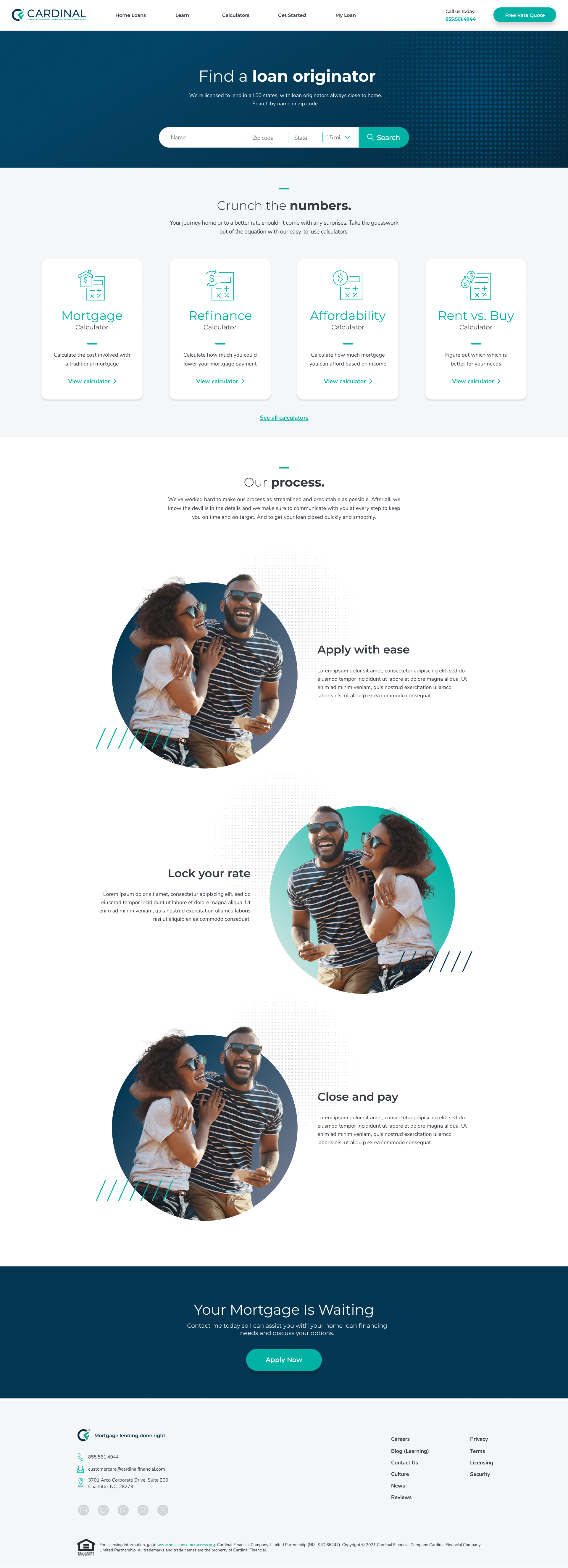
Desktop LO Search

Mobile LO Search
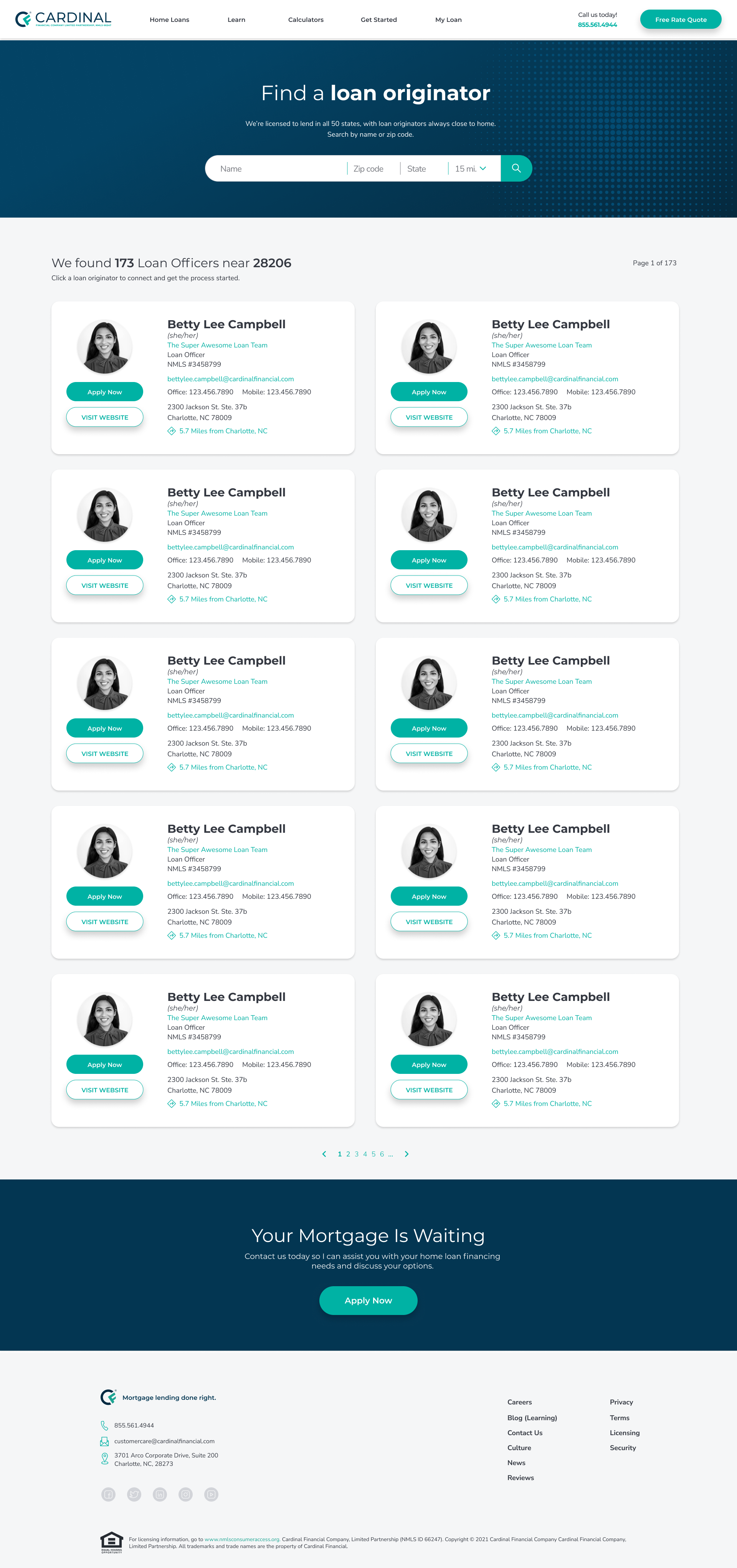
Desktop Results

Mobile Results

Results expanded
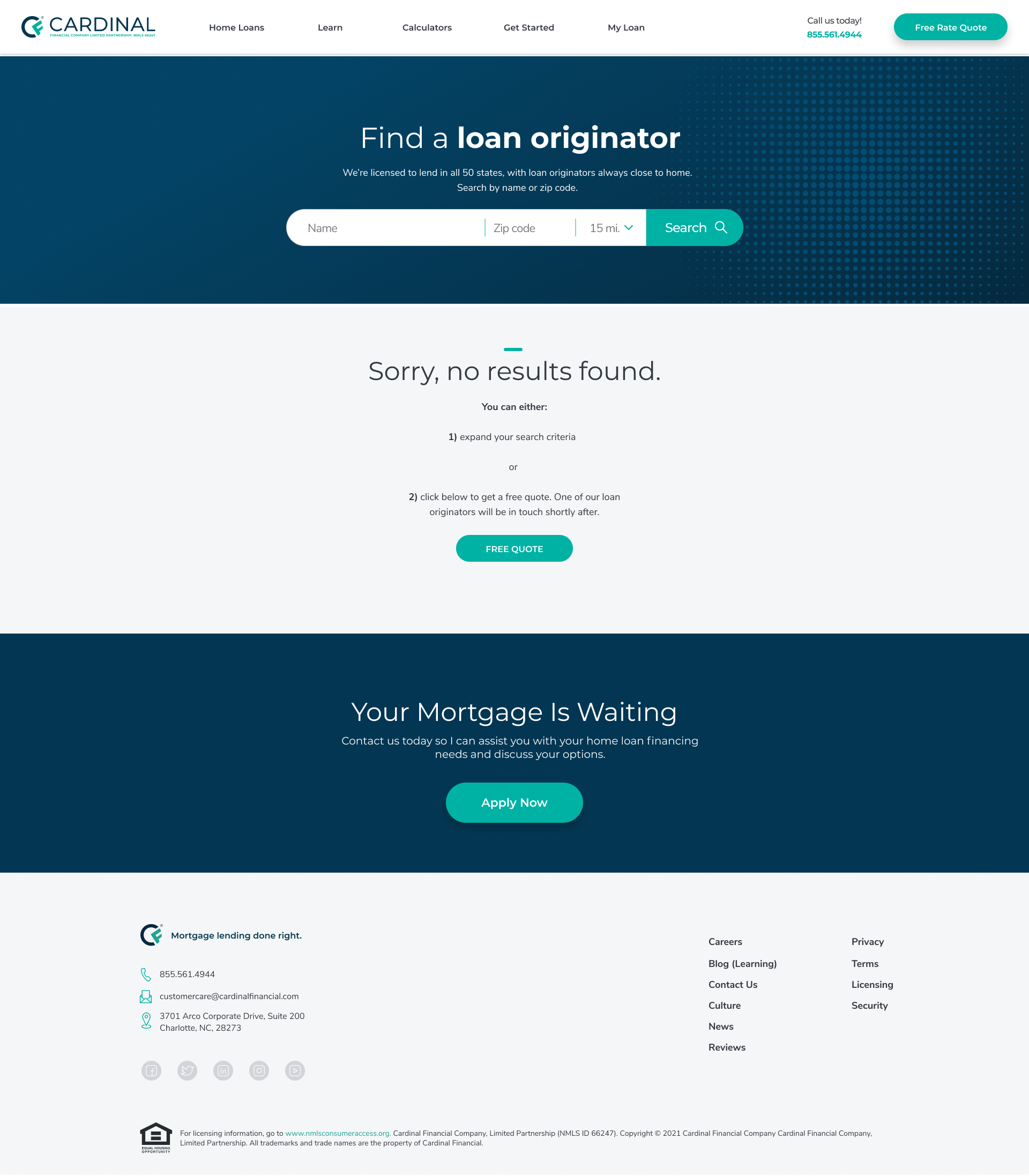
Desktop No Results

Mobile No Results
Career Search
Like most companies, Cardinal offers a variety of positions nationwide and remotely. This tool helps potential candidates find opportunities that best fit their skills and preferences.
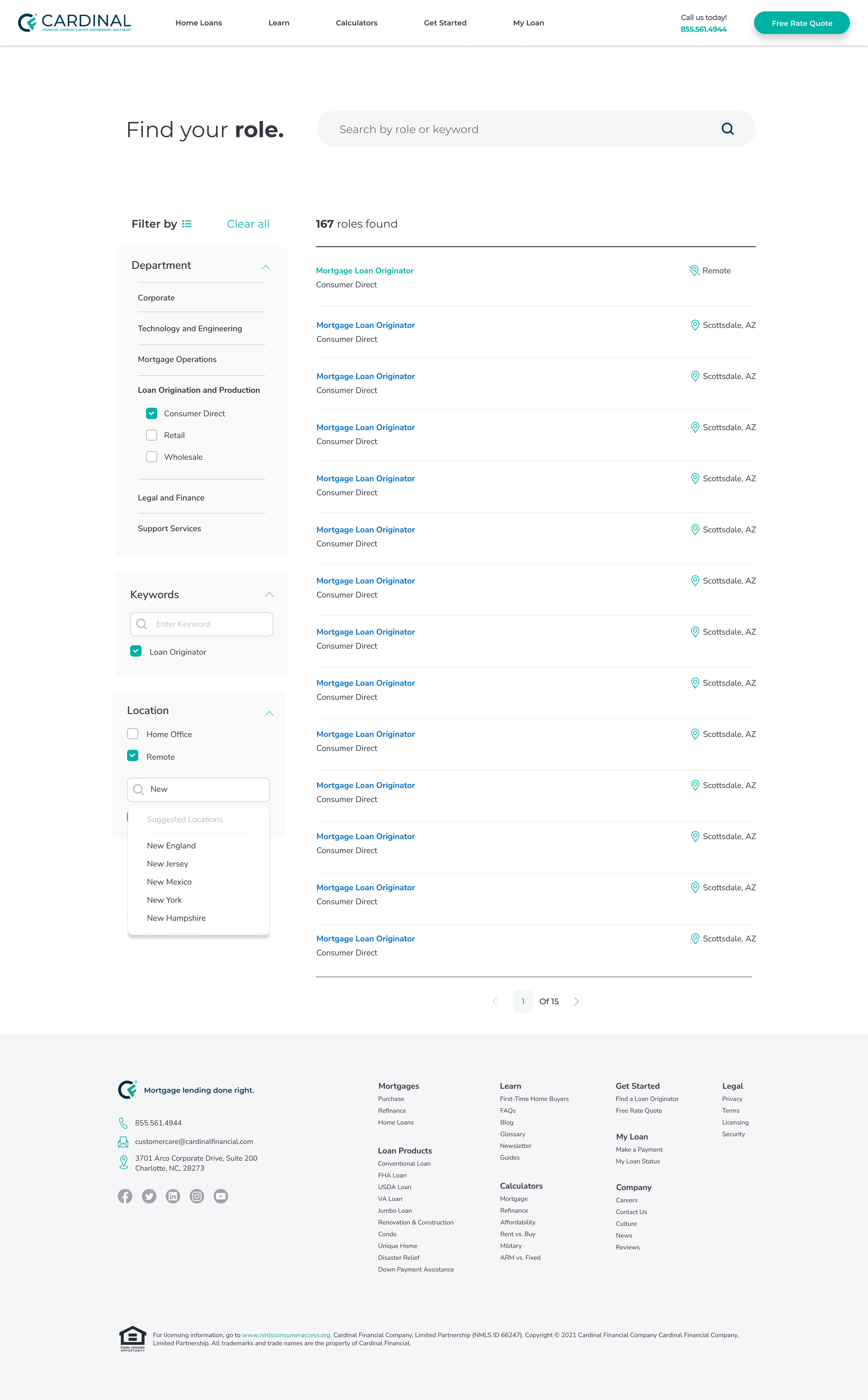
Desktop

Mobile

Mobile Filters
Design Collection
This collection of section landing pages highlights some of the more visual design focused elements from my work at Cardinal.
CardinalFinancial.com Desktop
CardinalFinancial.com Mobile
Careers Main Desktop
Careers Main Mobile
Mortgage 101 Desktop
Mortgage 101 Mobile
Product Page Desktop
Product Page Mobile
Home Buying Desktop
Home Buying Mobile
Services Desktop
Services Mobile
Ideas Desktop
Ideas Mobile


