
Lenovo: Welcome
The Lenovo Welcome app is designed for new Lenovo PC users to enhance their onboarding experience. It introduces users to their new computer, offers exclusive deals from Lenovo’s technology partners, provides an option to purchase extended warranties, offers free software utilities for installation, and introduces Lenovo Vantage—a comprehensive application for managing and maintaining their device.

Redesigning the Welcome App
Overview
The Lenovo Welcome app serves as a key touchpoint for new Lenovo PC users, introducing them to their computer and various features. One of its primary objectives is to promote the purchase of an extended warranty, offering comprehensive coverage beyond the standard warranty—similar to AppleCare for Macs. However, the app’s outdated design and confusing warranty options led to a decline in extended warranty purchases.
In addition to promoting extended warranties, the app’s other objectives included:
Introducing users to their new computer.
Presenting offers from Lenovo’s technology partners.
Offering free optional software utilities for installation.
Familiarizing users with Lenovo Vantage, a tool for maintaining and updating their device.
Lenovo’s initial request was to “freshen up the design.” However, the UX team saw an opportunity to reassess the user flow and address deeper usability issues.
The Challenge
The app faced several challenges:
Confusing warranty offerings: Users struggled to understand the benefits and options for extended warranties.
Outdated design: The interface did not reflect Lenovo’s modern branding and was not optimized for task clarity.
Low user engagement: The complex flow deterred users from completing key actions, including purchasing extended warranties.
The goal was to simplify the flow, improve task clarity, and increase extended warranty purchase rates while addressing other usability pain points.
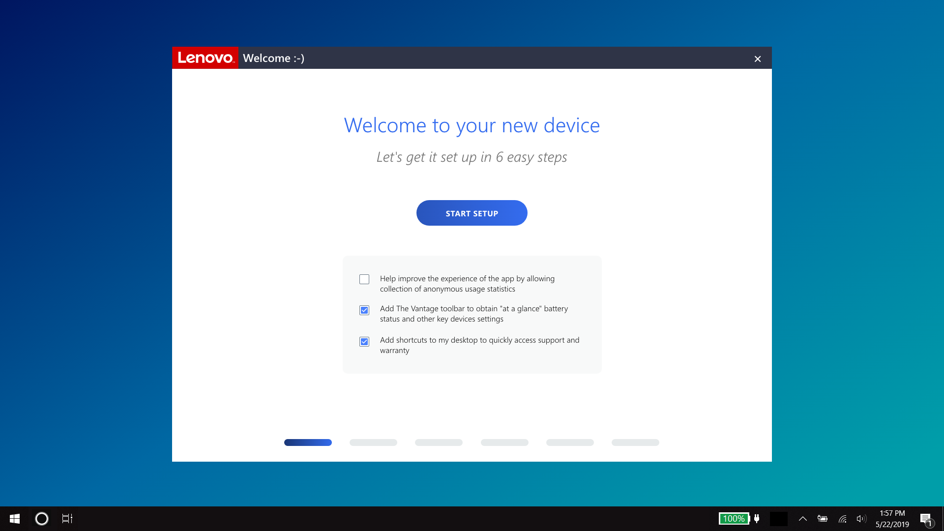
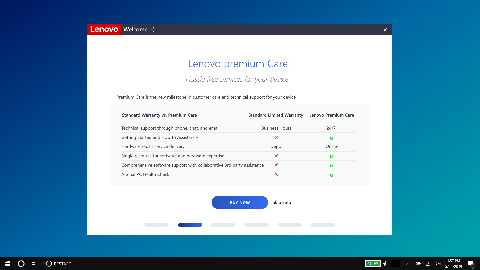
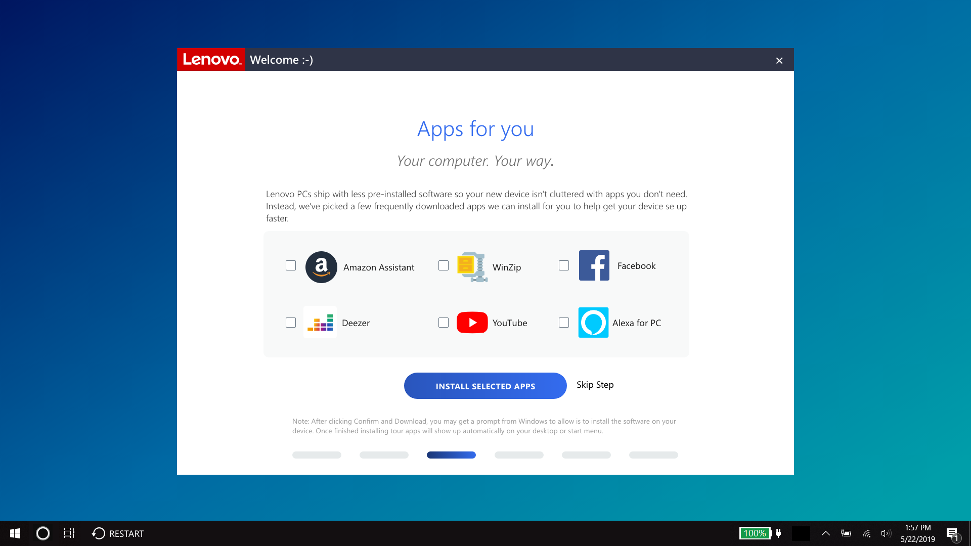
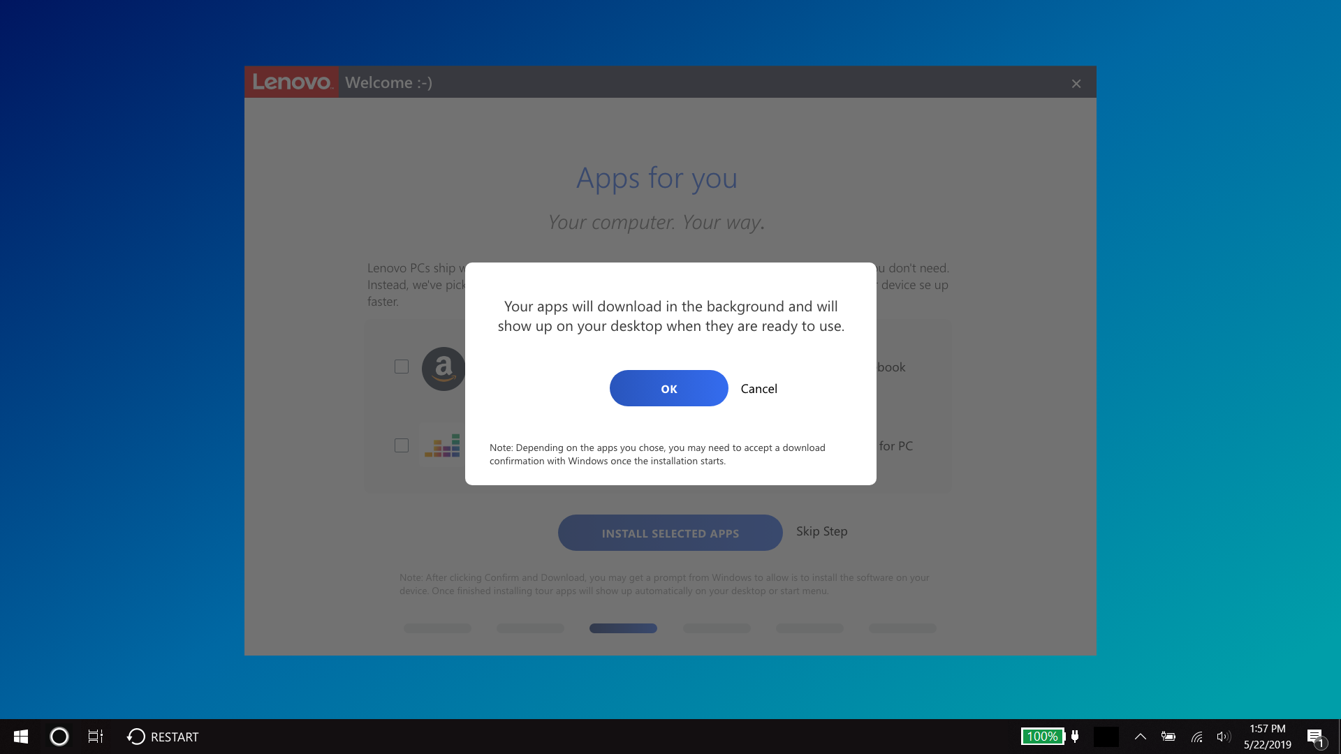
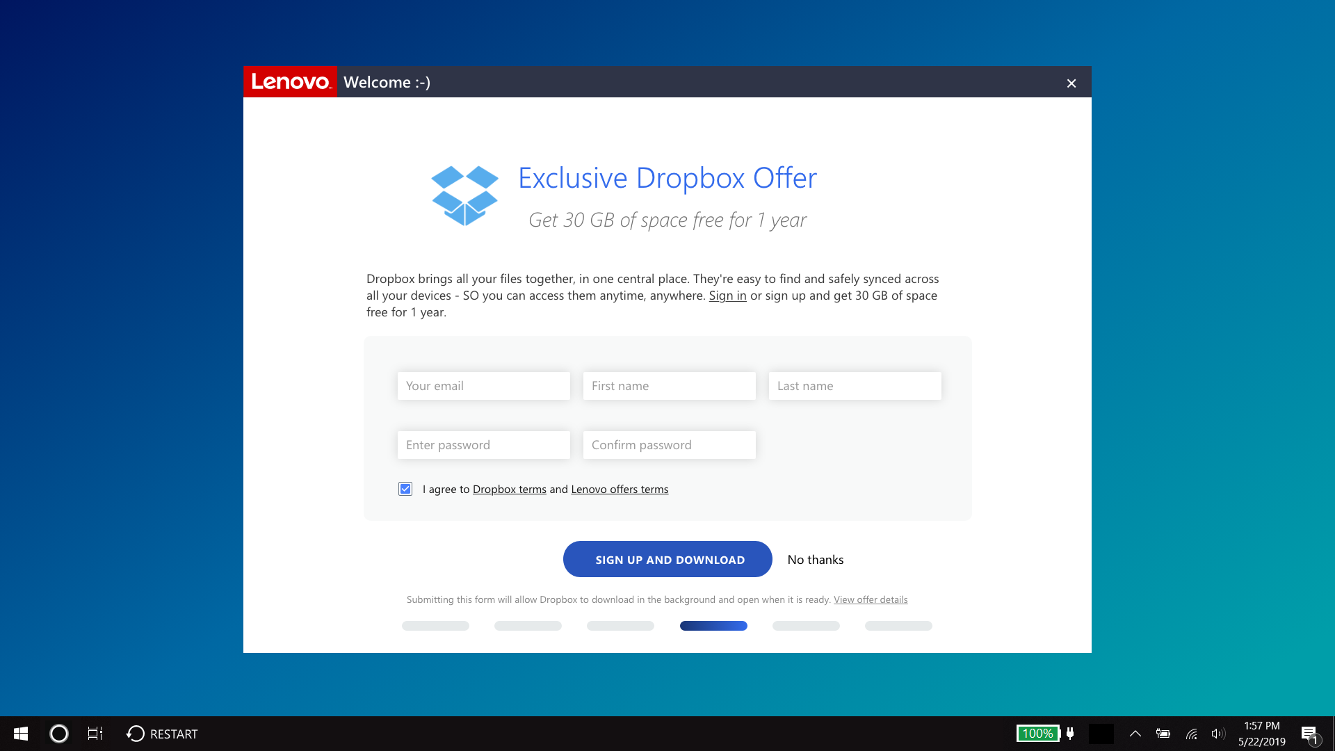
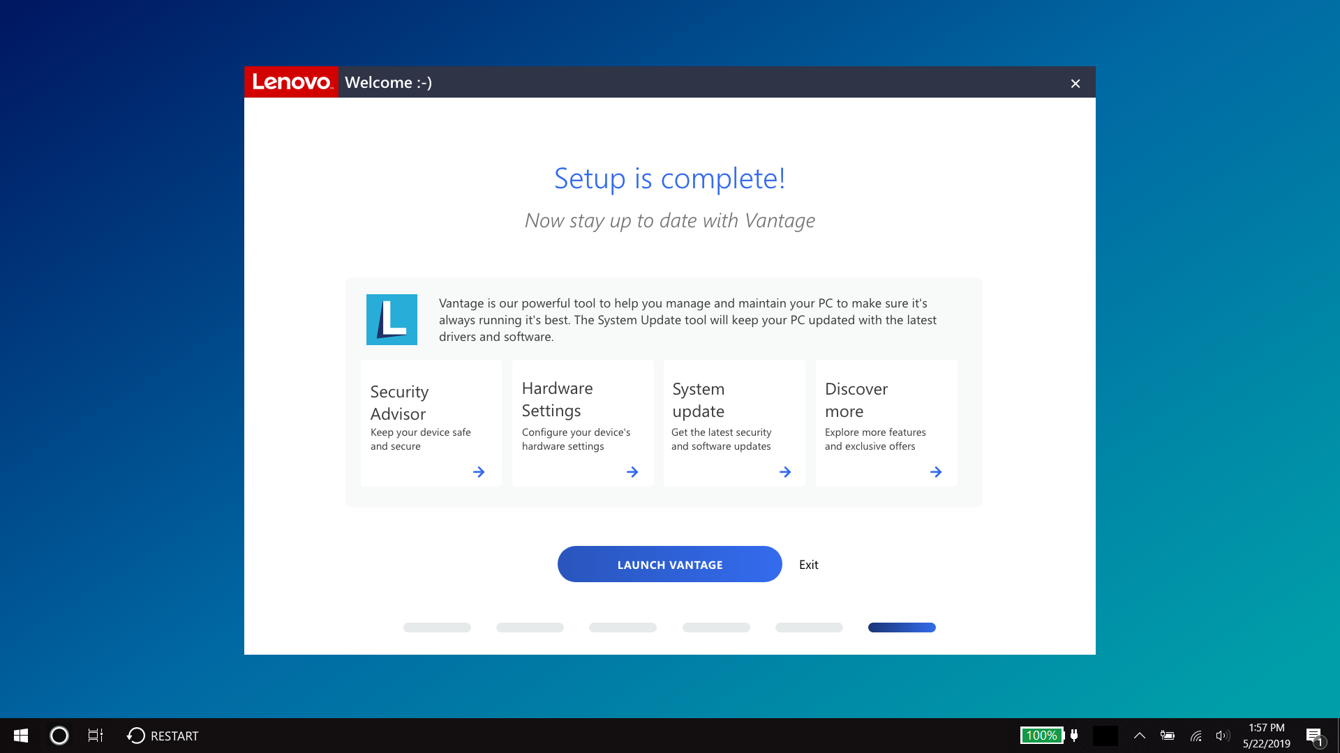
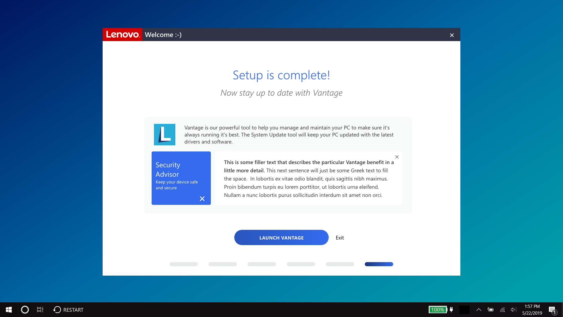
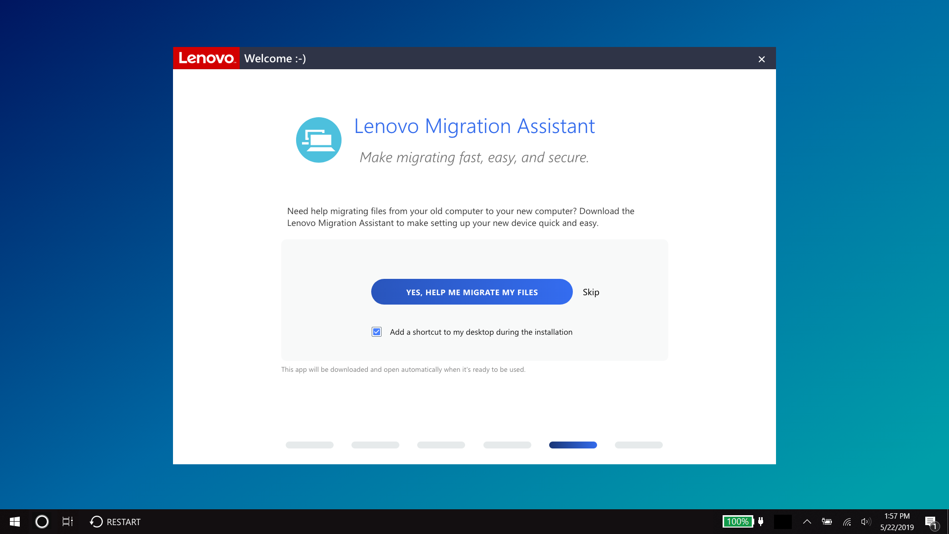
Original Welcome App
Looking at these frames, you can observe the outdated design that creates visual clutter, making the intended purpose unclear. This lack of clarity caused users to spend more time trying to understand what actions were expected in each section.


The Process
1. Research and Discovery
Conducted a heuristic evaluation to identify pain points in the current flow.
Analyzed user data, revealing drop-off points, especially during the extended warranty selection process.
Held discussions with stakeholders to align on key objectives, focusing on improving warranty purchase rates and overall user engagement.
2. Ideation and Design
Developed a concept to streamline the onboarding process:
Simplified warranty options with clear, concise descriptions and benefits.
Introduced visual aids and progress indicators to guide users.
Updated the design to reflect Lenovo’s modern brand identity while maintaining accessibility and usability.
Created wireframes and interactive prototypes to test new flows.
3. Testing and Validation
Set up an A/B test comparing the original app flow with the redesigned prototype.
Conducted onsite usability tests with users to gather qualitative feedback and measure quantitative outcomes.
New Wireframes
This is the new concept that was tested. What you’re seeing is basically a combination between a wireframe and the final design due to time constraints. The goal here was simplicity to put a greater focus on the task.
The Prototype
It all begins with an idea. Maybe you want to launch a business. Maybe you want to turn a hobby into something more. Or maybe you have a creative project to share with the world. Whatever it is, the way you tell your story online can make all the difference.
The Results
Quantitative Outcomes
35% faster completion times: Users spent less time on each page and navigated the onboarding process more efficiently.
Increased warranty purchase rates: Simplified options and clear messaging led to improved conversion rates. Warranty options were more quickly understood.
Qualitative Feedback
Users found the new design modern, intuitive, and easy to navigate.
Many appreciated the clarity of the warranty options, noting it helped them feel more confident in their decisions.
A memorable comment from one tester familiar with the old app: “Oh, OH, I see what you did here. This is much better!”
Key Takeaways
Clarity drives conversion: Simplifying complex offerings, such as warranties, can significantly improve user confidence and engagement.
Iterative testing ensures success: A/B testing and user interviews validated design decisions and provided actionable insights.
Design beyond the ask: While the project began as a visual refresh, addressing deeper UX issues yielded a greater impact on user satisfaction and business goals.
Reflection
This project reinforced the value of user-centered design and the importance of rethinking user flows for clarity and efficiency. By simplifying the warranty purchase process and enhancing the overall onboarding experience, we not only met Lenovo’s business objectives but also delivered a product that resonated with users.

Original

New Design